I reached out to Product Designer, Madison Rear at OS Maps. I’m a big fan of maps and thought it would be cool to work for them. Madison was kind enough to offer me a brief to work on the dashboard for past activities on thier iPhone app.
Initially the brief was a UI challenge:
Mock-up a “My Activities Dashboard” for OS Maps. This is the section where users would go to see what routes they have recently recorded / followed. It should have information about distance and duration for each route and could include some summary statistics (e.g. total for the year). We want to give you a bit of leeway here, we want users to come here for more than just seeing their stats.
Ordinance Survey (OS) have been making maps for more than 200 years.
They produce very detailed paper maps for outdoor enthusiasts. These maps can now be accessed online and on their app, with a subscription.
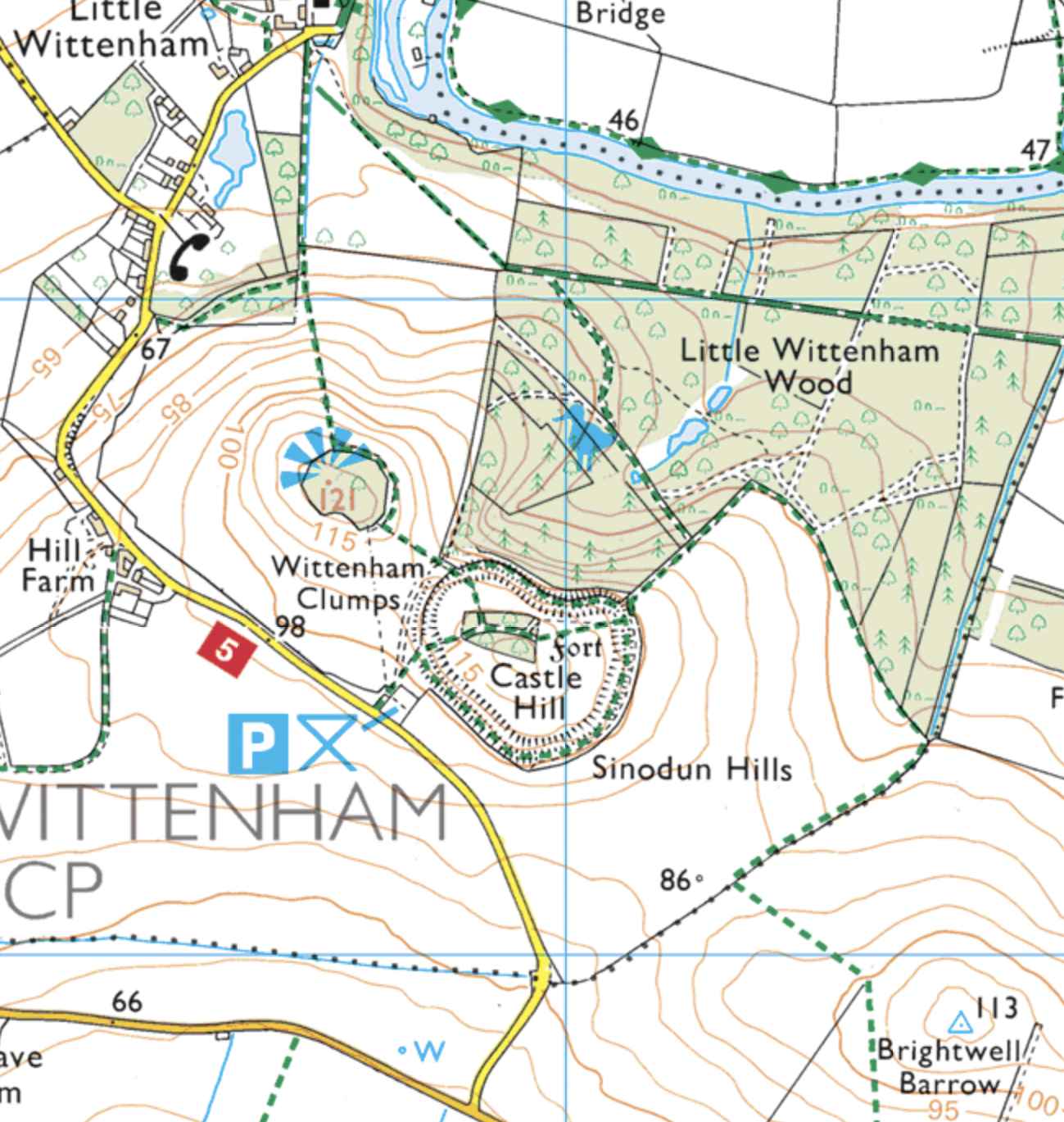
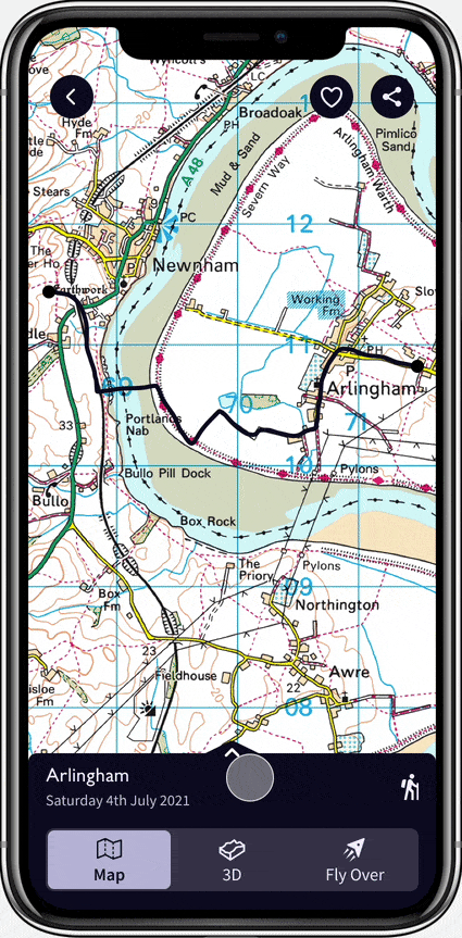
They differ from other providers like google maps, where the map is used as a canvas to display other information, such as shops and directions.
LEFT: Wittenham Clumps, OS Maps
RIGHT: Wittenham Clumps, Google Maps


It would have been great to spend time with users in the wild, but I had to settle for zoom while we were in lockdown.
Talked to outdoor enthusiasts on a hiking forum about how they use the app, the competitor’s apps and their activity tracking habits.
Asked a dozen students three questions to understand more about the desire to track activity.
Outdoor enthusiasts were tracking their activity with GPS devices like Garmin smart watches, and uploading the data to Strava and Garmin but not into the OS Maps platform.
Why don’t they?
What’s missing for them?
Those who tracked their activity found the data a bit meaningless, and would like to have someone to analyse and summerise it. Make it meaningful.
See Achievements instead of just statistics?
OS have already built these cool features; 3D augmented reality routes & route fly overs, but they are given little or no prominence in the app.
Give people an easy way to import their data into the app
Allow people to show off thier past routes using existing OS Maps features:
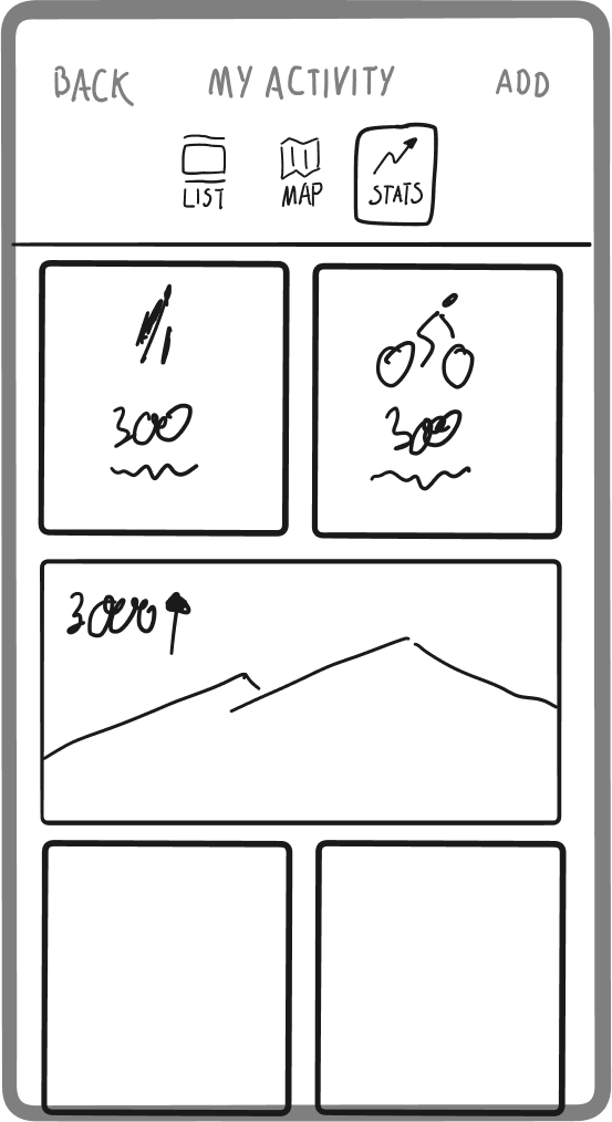
Summerise user achievements and make statistics more interesting

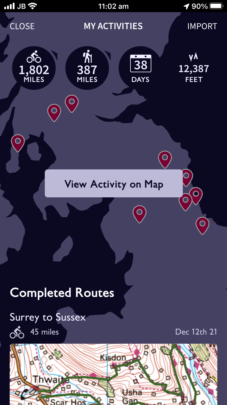
This UI design for the dashboard was chosen for it's modern layout. It displayed headline stats, previous route tiles and a map of recent activity. I felt that the ability to browse by map was important for a maps app.
I asked participants to talk me through these screens. The main feedback points were:
Lack of affordance to these activity stats.
More importantly, the stats were “meaningless”. They didn’t capture or reflect the achievement or what the event was like.
Users understood the pins were previous activity but it was busy and crowded.
Test participants expected these more promiently and felt they were mostly what they expected to see in past activity.
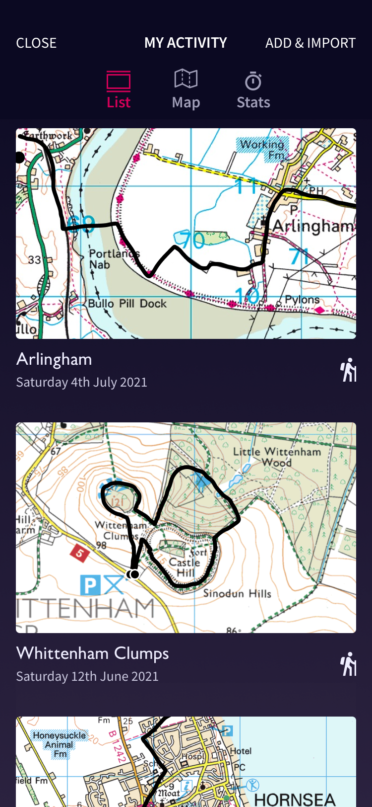
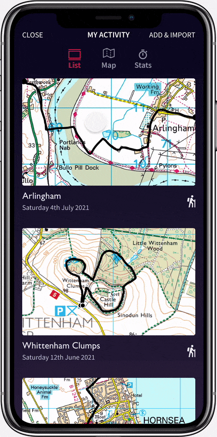
A key iteration in the design was separating the map view, list view and stats view into tabs.
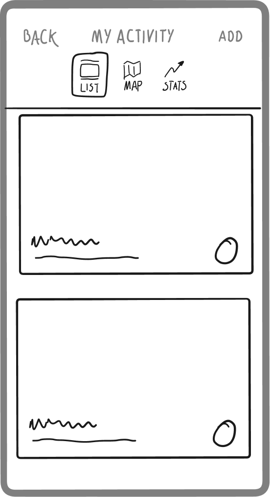


Trip cards already existed in the app, but they were focused on possible future activities, rather than the specifics of trips completed in the past such as actually time taken, rather than estimated.
The past trip card needed to display the data about time, gradients, distance, but it was also the obvious place for integrateing the 3D maps and route flyovers that users thought were “cool!” and wanted to share.

To maximise user delight with the past trip cards, attention was paid to the design of the transitions between the list view and the details panel.
From here, the 3D/AR and fly overs views were promoted to users with larger tabs.

In the final round of testing, I let participants explore the app in their own way. I asked them to think outloud as they went. There were no fixed goals but all five participants were interested enough to visit all the screens without prompting.
As I experienced in the earlier research phase, lots of people loved the Fly over feature, and expressed a desire to share it with friends.
A special thank you to Madison Rear for giving me the opportunity to work on an OS maps project, albeit a fictional project.
Robert Penaloza Photography - Unsplash
All OS map imagery copyright Ordinance Survey